Your higher education institution caters to a wide variety of students with the various programs you offer — and that gives you the opportunity to strategically leverage your website to attract, engage, and convert prospective students through specific, targeted landing pages. So what does a great higher education landing page look like, and how can you use them to convert through both paid and organic higher education marketing? Let’s find out.
What is a higher education landing page?
A higher education landing page is a standalone web page offering specific information and designed specifically for students to take a desired action — and is a key component of a higher education marketing strategy. This dedicated landing page should position the program based on your student persona for the program, offer all relevant information, and be SEO-optimized so that each page is driving quality organic and paid web traffic from students researching your program.
Read next: 4 Strategies to Optimize Your Higher Education Lead Generation
How to create a stand-out higher education landing page
Like everything else, there are good higher education landing pages and there are bad ones. Good college landing pages attract the right target audience of prospective students, provide them with the information they’re looking for, and encourage them to take the next step — whether that’s contacting you for more information, downloading a course PDF, or signing up to receive informational emails.
A bad one, of course, will not achieve these goals. It might attract the wrong kind of prospective student (perhaps because your ideal student persona hasn’t been clearly defined), fail to provide the information the student is looking for, or it might be a dead end with no clear next steps for the student to follow.
So what does a great higher education landing page design look like, and how can you create one?
1. It has consistent messaging
When it comes to higher education landing pages that perform well, the key is consistency. In other words, the language of your landing page should match the language on your advertising campaigns.
And consistent messaging is largely why landing pages exist in the first place. Your website’s home page has to meet dozens (if not hundreds) of different needs — your landing pages exist to drive traffic that is looking for one specific need to be met. If your landing page is inconsistent with your ad, full of irrelevant information, or is trying to serve too many purposes at once, your prospective students won’t be able to find what they’re looking for and will bounce. Not what you want!
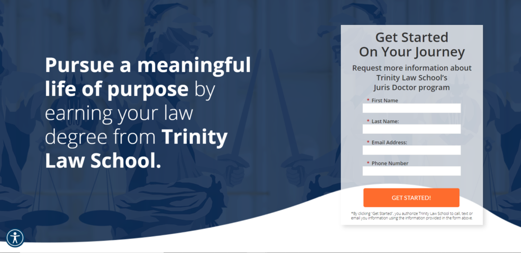
Example: Trinity Law School expertly aligns their ad messaging with their landing page copy, to deliver a landing page that meets the specific need of the prospective student who would be searching for more information about their law program.
Read next: Your Guide to Recruiting Students for Higher Education
2. It provides clear, relevant information
Your prospective students are looking for specific information about your program — that’s why they searched for you to begin with. It’s crucial to understand what kind of questions prospective students are asking about your program, and to succinctly and clearly answer those questions on your landing page.
Include key pieces of information like course learning outcomes, scheduling, cost, location, pre-requisites, and any other information your prospective students might be looking for. You can even take it up a notch and provide social proof in the form of alumni testimonials.
Example: UCLA does an excellent job of providing clear, succinct information about all of their higher education programs. From the duration of course to the semesters that it offers to the format offered — all the information is present at a glance and easy to digest.

3. It sports an eye-catching design
We know first impressions mean a lot — and that’s no less true when it comes to your landing pages. Your landing pages may be the first impression that your institution has on a prospective student and your design matters.
What makes a good landing page design? First, you want your school’s branding to be evident and easily recognizable. Second, you want to emphasize the most important information in your headings and bolded text. And third, you want to make use of eye-catching images and graphics that demonstrate your landing page’s key points and make for a compelling user experience.
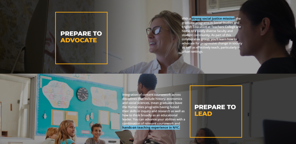
Example: Columbia University’s Teachers College utilizes photography, unique design, strong headings, and highlighted text to emphasize the most important information on their landing page and expertly guide users through the page.
Read next: 3 Rules for Successful Email Marketing
4. It’s optimized to generate leads by allowing prospective students to learn more
The last step of creating a higher education landing page that converts is providing ways for prospective students to convert! After providing consistent messaging, answering all common questions about your program, and designing your page in an eye-catching way, the right prospective student’s interest should be piqued — and they will be looking for next steps.
A stand-out higher education landing page provides clear avenues for students to advance in the enrollment funnel, by giving them opportunities to reach out and learn more, provide their email for updates, or download gated educational material. Your ultimate goal is to generate qualified leads, and an optimized landing page with effective calls-to-action is a perfect lead generation tool.
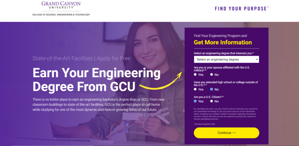
Example: Grand Canyon University incorporates multiple calls to action that allow students to progress in the enrollment funnel. Above the fold, there’s a contact form field complete with a few questions to give marketers an understanding of their leads, and further down the page, there are several opportunities for students to get more information.
Read next: Your Complete Guide to CRM for Higher Education
Specific, targeted landing pages are an excellent tool to drive quality traffic to your website, introduce students to your programs, move prospective students through the enrollment funnel, and generate qualified student leads.
At Thinking Cap Agency, we’re dedicated to driving quality student inquiries that increase enrollment yield — and with over 30 years under our belt, we know what we’re doing. Contact us today to boost your student enrollments.